Subscribe
Sign up for timely perspectives delivered to your inbox.

Recent posts on the “quantity theory of wealth” may have been heavy going, so what follows is an attempt to explain the approach more simply using charts of US data extending back over 100 years.
The starting point is the observation that the stock of broad money has risen by more than nominal GDP over the long term*.
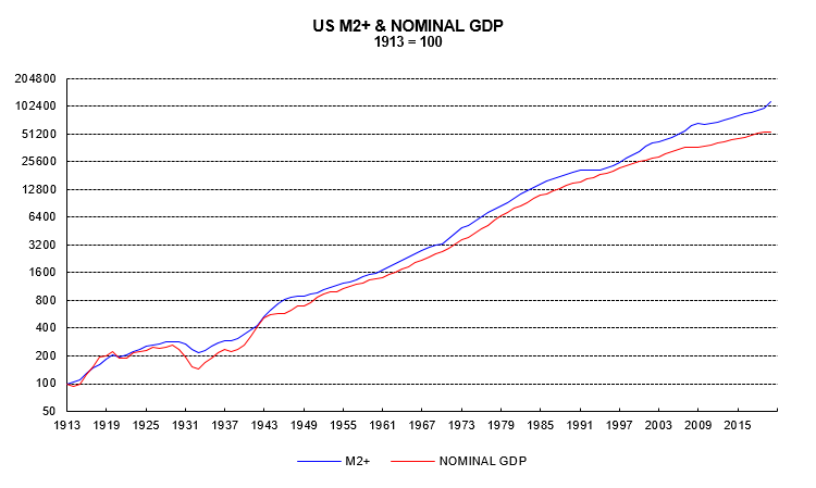
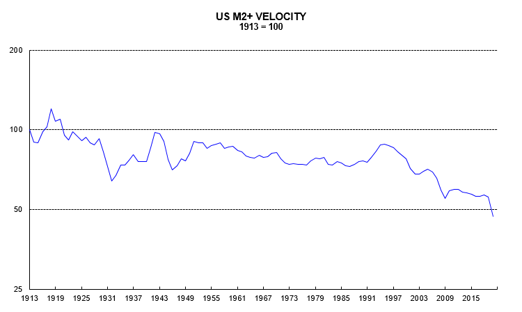
There has, in other words, been a trend decline in the income velocity of money (nominal GDP divided by the money stock). Velocity fell at an average rate of 0.5% pa over 1913-2019.
If nominal GDP had risen line with broad money since 1913, its 2019 level would have been 79% higher.
What explains this divergence? The demand to hold money depends on wealth as well as income. In the same way that consumers and firms hold money in proportion to their income / spending transactions, owners of financial and real assets hold money in proportion to the size of their portfolios.
While nominal GDP has risen by less than broad money since 1913, wealth has risen by more**.
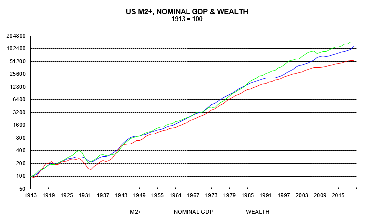
The quantity theory of wealth assumes that a 1% rise in nominal GDP has the same effect on the demand for money as a 1% rise in wealth. Further, a 1% rise in both leads to a 1% rise in money demand. These assumptions are reasonable and imply that the overall demand for money depends on the geometric average of nominal GDP and wealth (the square root of their product).
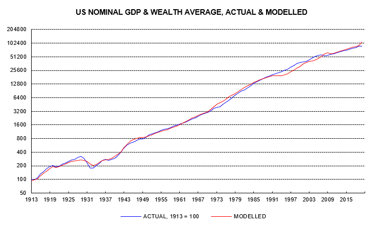
It works! The actual money stock has grown in line with the predicted level based on the combined nominal GDP and wealth measure.
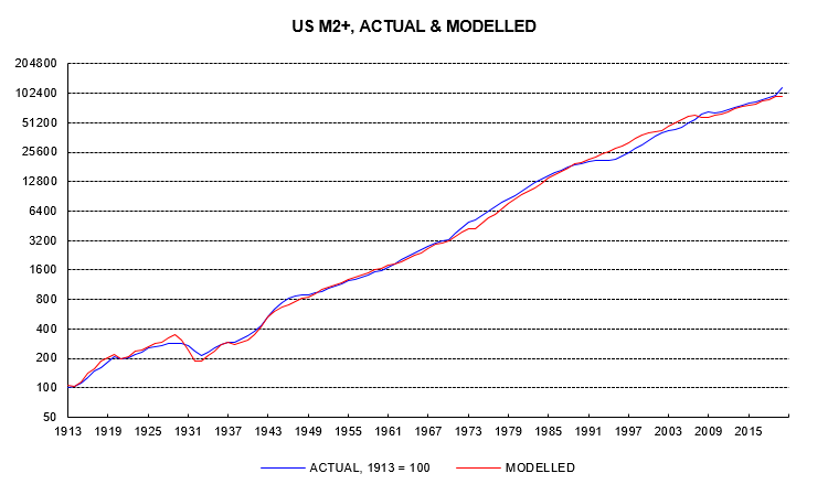
Equivalently, actual nominal GDP and wealth, in combination, have grown in line with the prediction based on the money stock.
The difference between the combined nominal GDP and wealth measure and its prediction indicates whether current levels of economic activity and prices of goods, services and assets are “too high” or “too low” relative to the money stock.
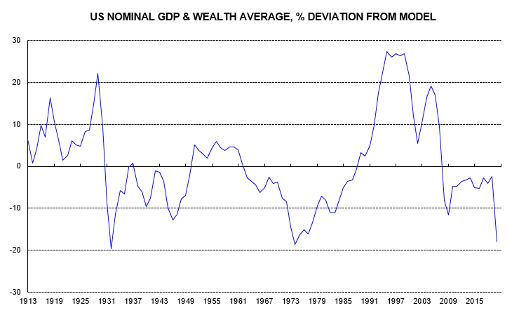
The largest “overvaluations” occurred ahead of the 1929 stock market crash / Great Depression and during the 1990s tech bubble. The largest “undervaluations” occurred during the Depression and in the inflationary 1970s, with those lows being challenged now.
The last data point in the chart is based on the current level of the money stock and 2019 levels of nominal GDP and wealth. Wealth is little changed from end-2019 but nominal GDP is down sharply. The model suggests that the combined nominal GDP / wealth measure would be 18% “too low” relative to the money stock even with nominal GDP back at its 2019 level.
A return to “fair value” requires some combination of a fall in the money stock and rises in nominal GDP and wealth. If the money stock were to remain stable at its current level, and nominal GDP and wealth were to rise equally, the implied percentage increase in each would be 22% (a 22% rise would eliminate the 18% “undervaluation”). If nominal GDP were also to remain stable (i.e. returning to its 2019 level but no higher), the implied increase in wealth would be 48%.
The chart shows that movements away from “fair value” can take many years to be reversed – the valuation measure is of no use for short-term timing. The value of the approach lies in indicating whether the monetary backdrop will act as a headwind or tailwind for economic activity and prices – including asset prices – over the medium term. The current message is positive.
*”M2+” is defined here as M2 plus large time deposits and institutional money funds. The old M3 measure also included repos and Eurodollar deposits – the Fed no longer compiles monthly data on these.